iPhone Duo Review: A Remarkable Pocketable Tablet With Phone-Sized Compromises
- John Gruber
- 407 reads
The iPhone Duo’s foldable screen and intuitive split view make a superb small tablet, but its cramped outer display and frequent Touch ID prompts undermine it as a phone.
The iPhone Duo’s defining achievement is also its central tradeoff: it folds an excellent small tablet into a device you can carry in a pocket, but the phone you get when it’s folded is a poor substitute for a regular iPhone. Open it and the Duo feels light, polished and unusually good for reading, video and two-app work. Close it and the narrow screen, awkward reach and repeated authentication prompts quickly become part of everyday use.
That division matters more than any single specification. If you want a tablet that can travel with you everywhere, the Duo makes a compelling case. If you value the fast, comfortable, one-handed interactions that make a phone useful dozens of times a day, its compromises accumulate. My week with the device felt less like using one product with two modes and more like switching between a great tablet and a frustrating phone.
A tablet that folds into your pocket
Closed, the Duo weighs 254 grams. That’s close to the 249-gram iPhone 18 Pro Max, but the Duo’s smaller footprint concentrates that weight into a denser-feeling object. It’s awkward to slide into or pull out of jeans, and it sometimes turns sideways in a pocket. The squat outer screen also makes the device unusually wide for its usable display area. It can function as a phone, but it doesn’t feel like a phone designed around quick, comfortable use.
The comparison with a small conventional iPhone is revealing. Even a lightweight version of the Duo, imagined as a standalone device, would have an unfamiliar shape. The iPhone 12 mini and 13 mini offered a much more conventional compact-phone design, yet Apple discontinued the line. The Duo asks buyers to accept an even less phone-like outer form, then adds the thickness and weight of the folded device.
Open it, though, and the experience changes dramatically. The inner display measures 7.6 inches, and the device is 4.6 by 6.5 inches. For comparison, the current A17 Pro iPad mini has an 8.3-inch screen, measures 5.3 by 7.7 inches and weighs 297 grams in its cellular version. The Duo’s display is smaller, but the open device is 15 percent lighter. In the hand, it feels like a particularly portable tablet rather than a phone stretched into an unusual shape.
That size works especially well for reading. Held vertically, the inner screen has the proportions of a small e-reader, and I preferred reading on it to using an iPad mini or a Kindle-like reader. Held horizontally, it suits video. The speakers are loud and distinctly separated, with unexpectedly good sound for a device this thin.
The display’s surface is another standout. Its nano-texture finish reduces reflections, including in bright sunlight, while still looking and feeling appealing. The finish also makes the fold crease far less distracting. The review describes it as a replaceable surface layer, an approach that may make wear easier to address over time. For me, the matte surface is an improvement I’d welcome on a conventional iPhone as well.
There is a tradeoff inherent in the foldable shape. The Duo’s inner screen can be excellent as a tablet while the closed device remains uncomfortable as a phone. Engineering can soften individual problems, but the design still has to fit two different uses into the same hardware. The question for buyers is which use they’ll care about most.
The outer screen makes everyday actions feel cramped
The closed display is not just small; it changes how familiar parts of iOS work. The system places the Dock and app toolbars along the outer edge of the screen, which is on the right when the Duo is closed. That arrangement helps keep controls accessible on a wide device, but it moves them away from the positions many iPhone users have relied on for years.
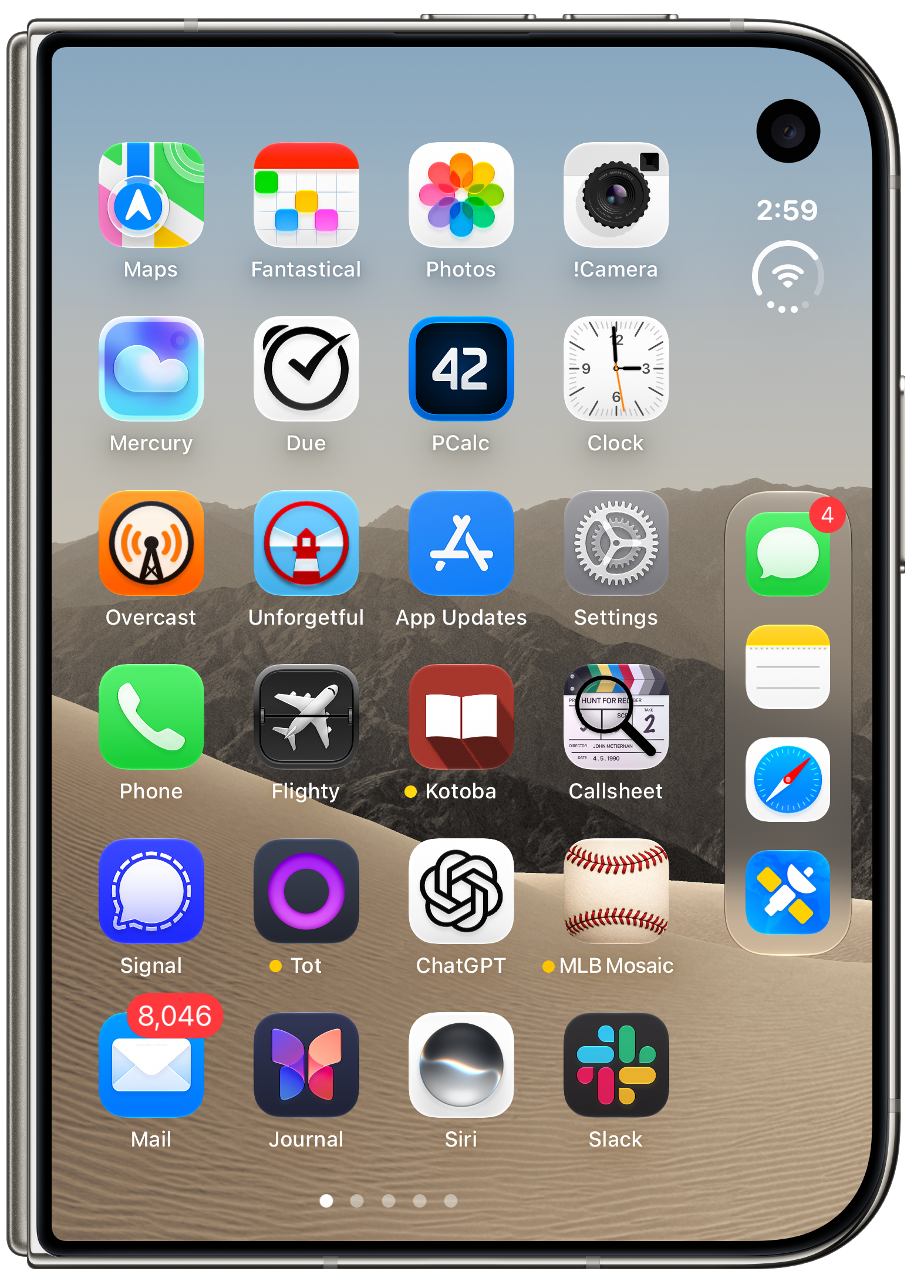
On the home screen, the Dock sits at the right edge, and its icons appear smaller than the rest. That’s a minor visual detail with a larger usability effect: the apps people reach for most often become the least prominent icons. It also breaks the familiar bottom-of-screen layout. I found myself reaching for Messages, Notes and Safari where they used to be, then correcting the gesture.
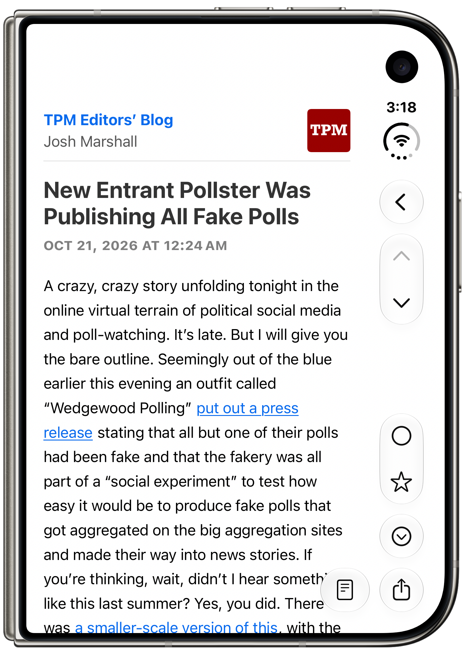
The same layout decision affects navigation inside apps. A back chevron that normally sits at the upper left can appear at the right edge instead. The underlying spatial idea of iPhone navigation is that moving back takes you toward the left. Reversing the button’s location makes that relationship feel less natural, even though the swipe-from-the-left gesture still works. This is the sort of small friction that may fade with habit, but it’s built into many everyday app screens.
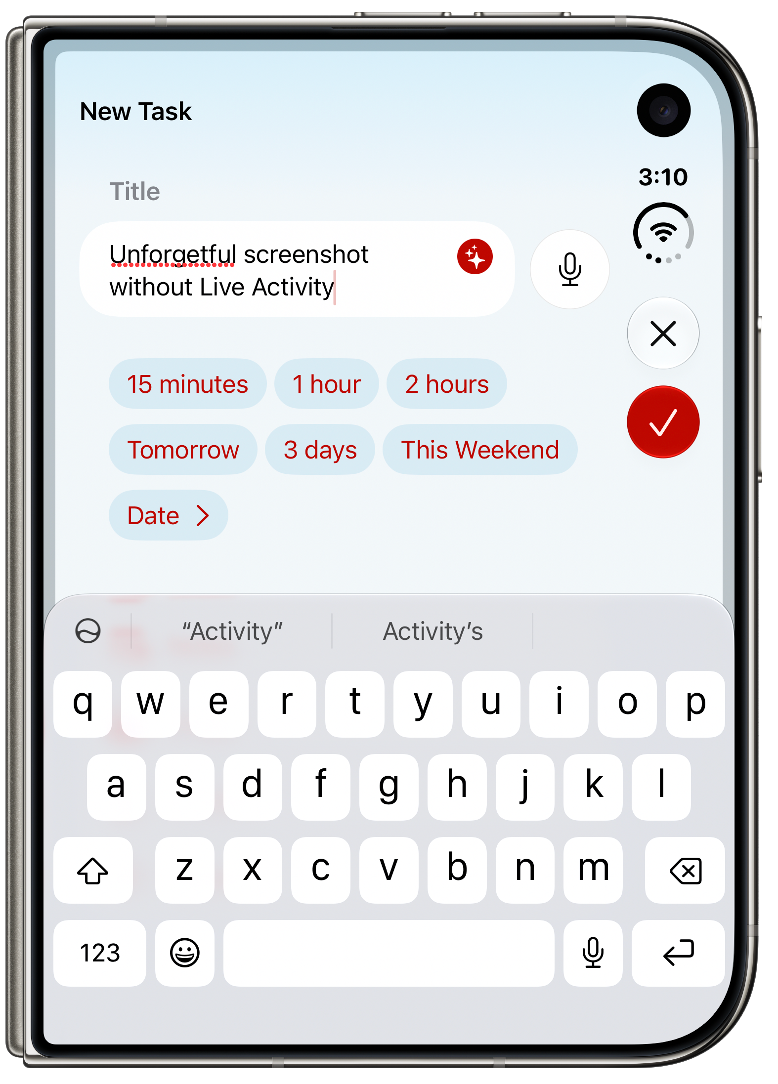
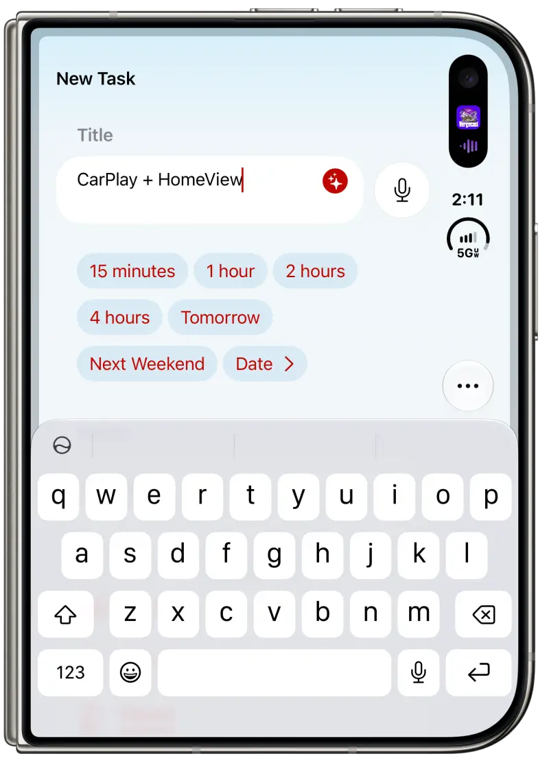
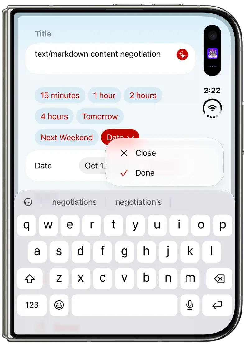
Space gets tighter when the keyboard is open. In a task-creation screen in Unforgetful, a Live Activity reduced the available toolbar area enough that the usual Close and Done buttons collapsed into a single overflow menu. The Done action was still there, but it took an extra tap to find. The interface was technically functional; the small screen made a simple action harder to spot.
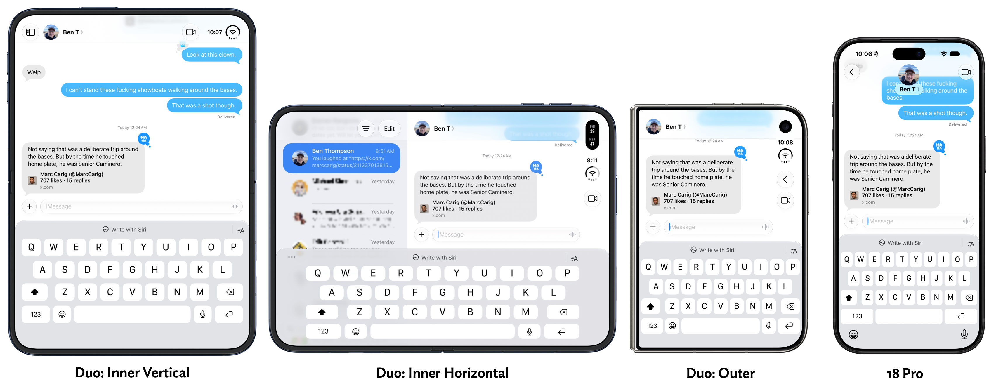
Messages shows the same limit in a more basic way. With the keyboard displayed, the outer screen leaves little room for earlier messages in a conversation. The inner screen in portrait orientation and a conventional iPhone 18 Pro show more context. The inner screen in landscape does not offer much more than the outer display, though rotating the Duo makes typing easier and gives the conversation more room.
The device also proved uncomfortable to use one-handed. Its width makes it a two-handed phone in practice, regardless of which hand you hold it in. Left-handed use has an additional physical irritation: a sharp corner at the lower left of the frame presses into the palm. In the right hand, that corner meets the base of the thumb more comfortably.
The screen layout may appear right-handed at first, but the more fundamental limitation is reach. The Duo is simply too wide for many controls to feel easy to reach with one thumb. Its outer display can handle quick checks, but anything that calls for sustained reading, typing or navigation makes the choice to open the device hard to avoid.
Split view gets tablet multitasking right
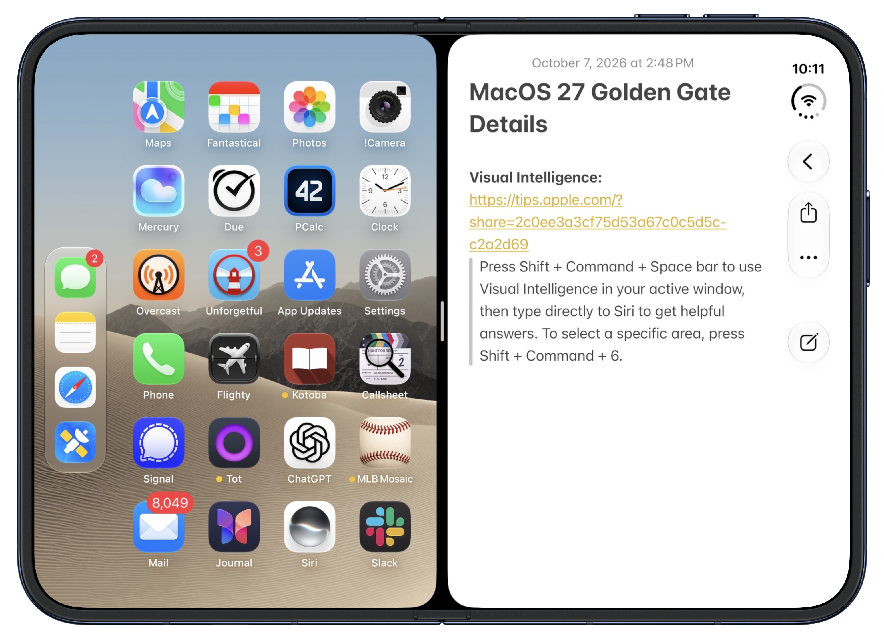
The Duo’s strongest software idea is its two-app layout. When the device is open horizontally, it can show two apps side by side, each in a space roughly comparable to an app on the outer display. The split stays even, with half of the screen for each app. That constraint makes the feature easy to understand.
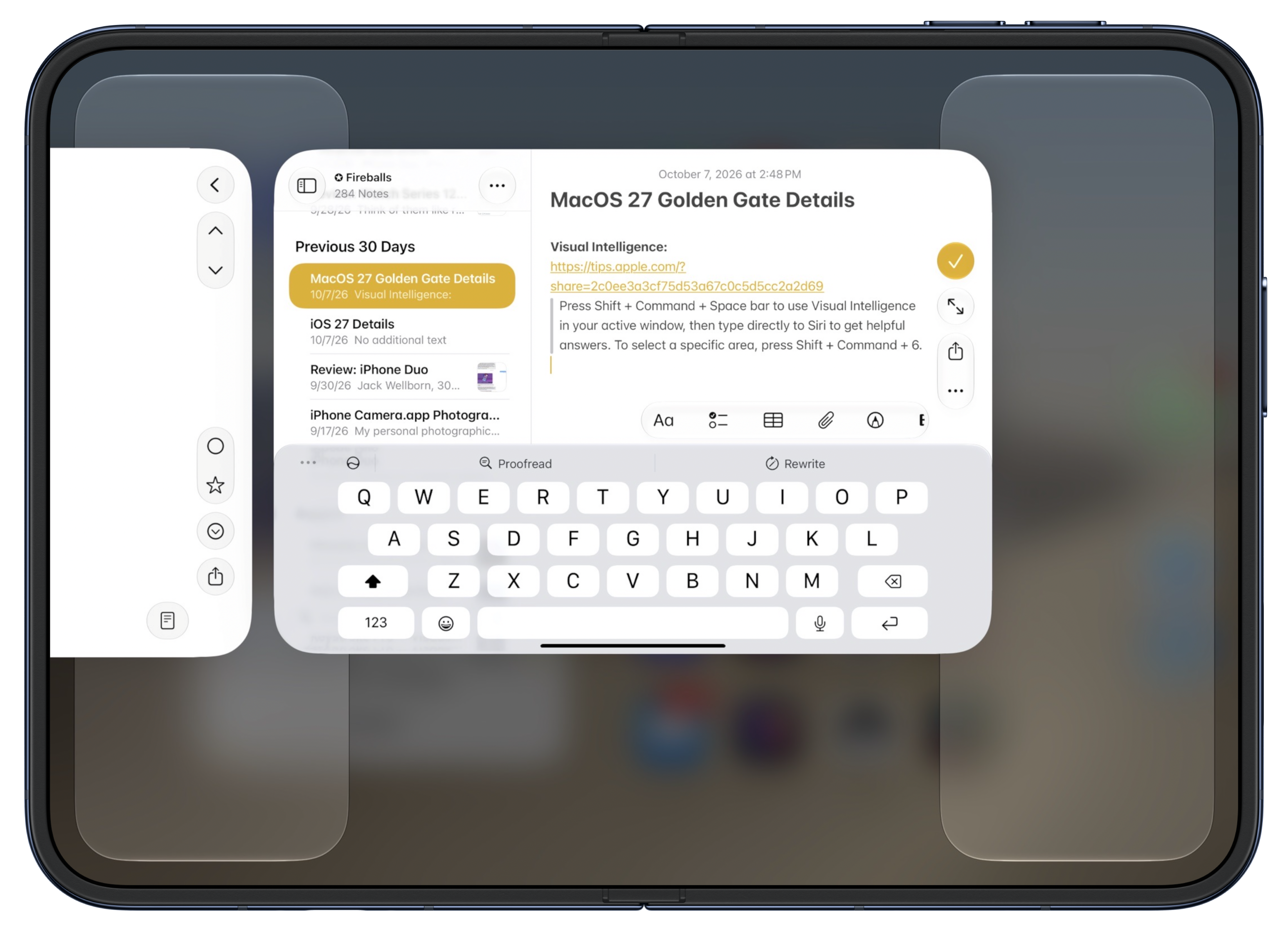
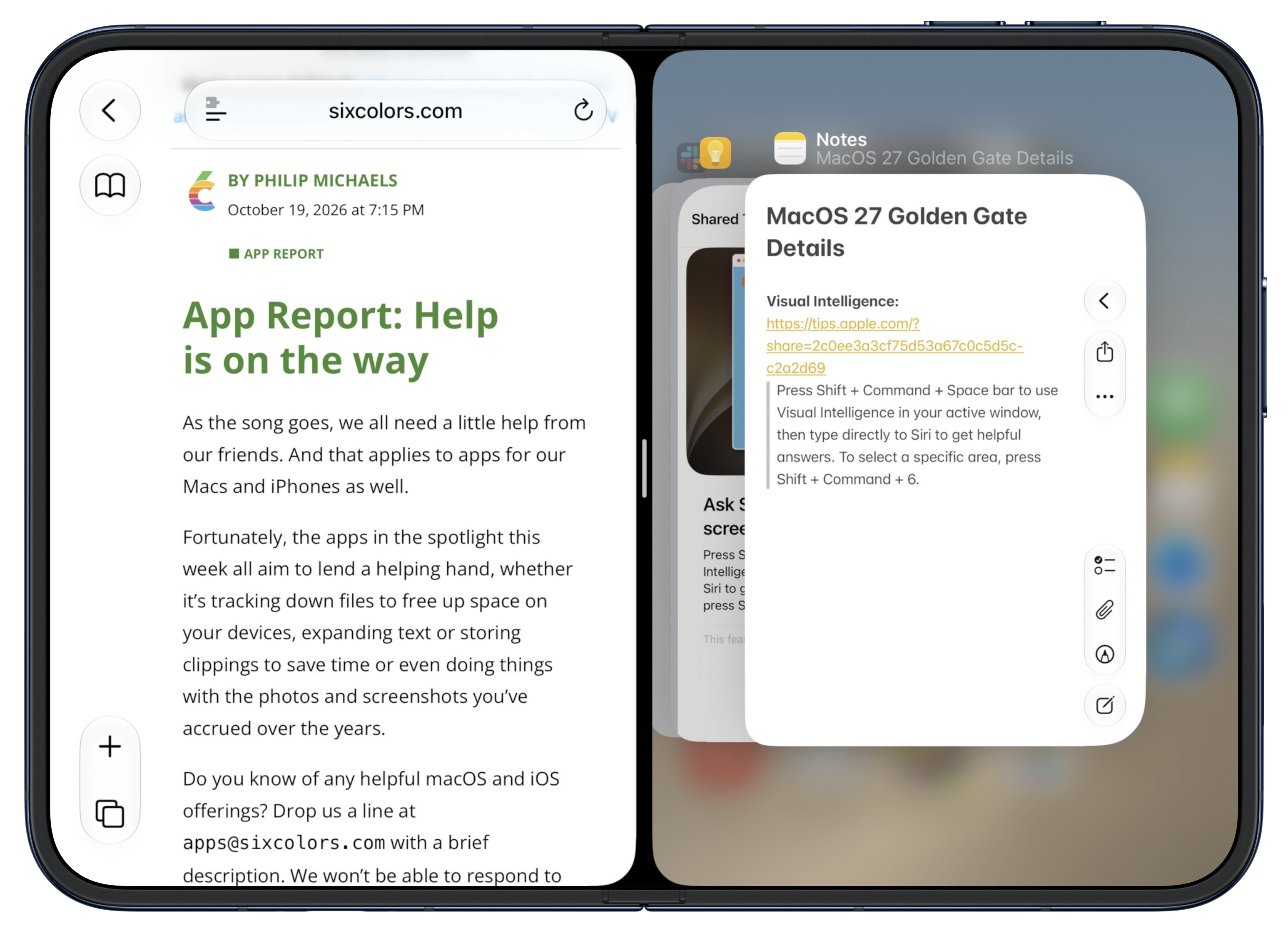
To begin, drag the home indicator upward from the bottom and keep moving. Shelves at the left and right edges act as drop targets. Place the current app on either side, and the other half shows the home screen. Tap an app there and it opens beside the first one. There’s no separate sequence of window controls to learn.
Each half behaves like its own small phone. You can return one side to its home screen or switch apps there without disturbing the other. A central home indicator controls the pair as a whole. The app switcher also avoids showing an app already open on the opposite side. If you want to go back to a full-screen app or home screen, the gesture from the middle does that.
The result feels natural because it builds on familiar app launching and switching. These aren’t conventional desktop windows with freely adjustable sizes. Instead, the interface treats the two halves as separate app spaces while keeping a clear way to control the combined view. The same app can appear on both sides, which makes it possible, for example, to view two Safari pages at once.
This simplicity throws older iPad multitasking into sharp relief. Apple introduced Slide Over and Split View with iOS 9 in 2015, when iPads still relied on a physical Home button for core navigation. With two apps onscreen, a single Home button could not clearly express whether the user wanted to leave one app, replace one side, or close the pair. Apple added extra gestures and controls, but the result often felt difficult to learn and easy to trigger by mistake.
The Duo’s on-screen home indicators make the model clearer: one for the app on the left, one for the app on the right, and one in the center for the pair. The controls follow the same basic logic as the rest of the system, so the feature needs little explanation once you try it. That’s a substantial improvement in interaction design, even if the fixed 50-50 layout limits how much control users have over the division.
There’s an interesting consequence to this: the Duo’s phone-oriented software makes it a more convincing tablet in this respect than the dedicated iPad interface. The split view is intuitive and useful without asking users to learn a separate windowing model. It’s a strong template for tablet multitasking, though whether Apple will bring this approach to other devices remains an open question.
One habit still takes adjustment. Closing the Duo doesn’t lock it; it switches from the inner display to the outer one. I repeatedly folded it, assumed it was asleep, and put it away while it remained unlocked. The device eventually locks through its normal behavior, and nothing went wrong during the review, but the action doesn’t match my instinct. The fold is a display transition, not a lock command.
Touch ID is the largest daily irritation
The first-generation Duo uses Touch ID in its side button rather than Face ID. That change affects nearly every part of the experience because a phone is unlocked so often. With Face ID, looking at the screen is usually enough to make unlocking feel automatic. With Touch ID, I had to remember to place a registered finger on the button, and I often had to do it again after switching how I held the device.
In a week of use, authentication prompts became the Duo’s most persistent annoyance. I tried to track how often I was asked for a fingerprint, and how often I had to enter the full passcode in situations where my iPhone 18 Pro would have unlocked with Face ID. I ran out of room in my notes. For me, the absence of Face ID is a reason not to buy this generation.
Apple Watch can reduce the friction. When paired with the Duo, and when the relevant setting is enabled, a nearby watch can unlock it. Each successful unlock produces a tap on the wrist. That makes the experience more tolerable for someone who wears an Apple Watch all day, though it adds a dependency that other iPhones don’t require.
The feature has limits. It only works with the iPhone the watch is paired to, so someone using two iPhones has to choose which one gets the watch connection. The review also found that watch-based unlocking did not work consistently. At times a fingerprint was still needed, and occasionally the device demanded a passcode. The reviewer suspected that pressing the side or Camera Control buttons while opening and closing the Duo might prompt the more stringent check, but couldn’t confirm the cause.
Watch unlocking also trades convenience for a weaker check. Handing the Duo to a child who was playing with its hinge caused the watch to unlock it. The watch gives a wrist tap and a control to lock the phone again, so the user can respond immediately. Still, the episode illustrates why watch proximity is not equivalent to checking the person looking at the display.
There is also an option to unlock the Duo by resting a registered finger on the sensor. It can save a step, but it wasn’t dependable in the review: sometimes the sensor didn’t recognize the resting finger, and sometimes the phone unlocked accidentally when the reviewer held it with a thumb over the button. That accidental behavior never happened with the reviewer’s Pro phones and occurred at least once a day with the Duo.
Authentication gets more confusing when the device is open. The button’s position changes relative to how people hold the screen, and its location does not match the reviewer’s expectations based on an iPad. In portrait orientation, it sits at the top on the left side. Rotating the device to landscape moves it in the opposite direction from the reviewer’s established habit. During a week of use, the button sometimes ended up at the bottom because the device had been turned the wrong way.
For buyers who wear an Apple Watch constantly, the shortcut may make Touch ID manageable. For anyone who doesn’t, frequent prompts are likely to wear thin. A future Duo with Face ID on the outer display would address the most noticeable phone-mode problem; Face ID on both displays would make the open-tablet experience more consistent too.
Camera and hinge choices bring their own compromises
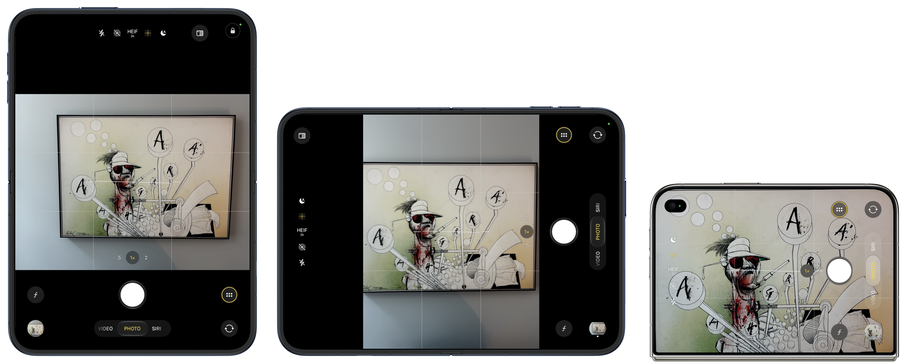
The main camera is aligned with the outer display. That makes the camera orientation familiar when the Duo is closed: hold the device vertically for portrait shots and horizontally for landscape. Open the Duo, and the relationship reverses. The sensor doesn’t rotate with the display, so holding the inner screen vertically produces a landscape image, while holding it horizontally produces a portrait image.
Apple chose the outer display because it expects people to use that screen most often when taking photos. That reasoning makes sense for a device used as a phone, but the inner display could provide a much larger viewfinder. Instead, thick black bars leave the preview at roughly the size of the outer screen, even when the Duo is open. The reviewer would have preferred a smaller preview on the outer screen and a larger one on the inner display, accepting the unusual orientation when the device is closed.
There’s a further mismatch between the outer display and the camera sensor’s aspect ratios: 1.44:1 for the display and 1.33:1 for the sensor. The full-screen viewfinder shows a slightly tighter crop than the resulting photo, so the captured image can include details that weren’t visible in the preview. That’s not necessarily harmful, but it can surprise anyone framing a shot precisely.
The camera itself is capable, though it doesn’t match the iPhone 18 Pro. Its main 1×/2× camera has specifications close to the previous year’s iPhone Air, with the newer A20 Pro image-processing pipeline. The Duo also supports newer Photographic Styles, including texture options such as film grain.
It lacks the Pro camera features: adjustable aperture, shutter speed and white balance controls, a histogram, Apple Reference Image, spatial video, ProRes video and RAW, and Apple Log. The second, 0.5× ultrawide camera is a useful addition. It enables ultrawide shots and close-up photography, with subjects as near as 2 centimetres in macro mode. The main camera’s minimum focus distance is 15 centimetres; the ultrawide camera can get closer than that.
The hinge and frame feel carefully made. The device opens and closes with a satisfying action, lies flat when open and stays shut when closed. A subtle plastic lip around the inner display keeps the two screen corners from hitting each other; while using the device open, that lip feels comfortable rather than obstructive.
Opening the hinge takes two hands and feels closer to prying the device apart than flipping it open. That effort makes it easy to press the side or Camera Control button by accident. The reviewer triggered four unintended photos while opening or closing the device in one week. On a conventional phone, those buttons are easier to avoid during ordinary handling.
Accessories complicate the design. Apple’s $80 silicone case adds enough material around the outer display to require a setting that shifts the usable screen away from the left edge. It also uses adhesive to stay attached. The $130 folio case has a higher-quality fabric feel and a kickstand, but it adds another cover to open before using the front screen. The reviewer preferred using the Duo without a case, while noting that a protective case for a foldable device is difficult to make unobtrusive.
App support is improving, but gaps remain
The Duo depends on developers adapting their apps to its unusual display. Apps that haven’t been built with the iOS 27 SDK can appear as small, phone-sized rectangles surrounded by black space on the inner screen. A zoom option enlarges them, but the result is still poor. Apps built with that SDK fill the display, though they may simply stretch a conventional phone layout without taking advantage of the Duo-specific tools in the 27.1 SDK.
The distinction is visible in real use. WhatsApp fills the inner screen but uses a scaled phone interface. Signal appears as a small phone-sized app against black. The NYT Games app initially had a cramped custom crossword keyboard, though an update released the following day fixed the layout in both orientations. Ivory and some banking apps had not yet added proper support during the review. Netflix, by contrast, was adapted well enough to make video on the larger screen enjoyable.
Apps that haven’t been updated can still run, but compatibility alone doesn’t create a good experience. The NBC Sports app had not been adapted. Video could be expanded from a small window, but tapping the screen returned the app to its miniature phone layout. That’s a significant limitation for a device whose larger display is its main reason to exist.
Support improved quickly over the review week. At first, few third-party apps worked properly, and the compatible ones were often beta versions. More updates arrived as the week went on, with the reviewer’s app library becoming noticeably more usable. That pace is encouraging, but buyers should expect the experience to depend on which apps they use and how quickly their developers respond.
Daily use, price and the buying decision
The Duo has several thoughtful touches beyond its main features. In StandBy mode, it can rest folded like a tent, showing a clock, calendar or photos; a Live Activity can expand to fill the screen. In a partially folded “laptop” position, apps such as Netflix can show video on one half of the inner display.
Battery life held up through a heavy day of use. The device often became noticeably warm, though not hot, and the reviewer didn’t find battery life suffering during the week. More demanding uses, such as graphics-heavy games, weren’t explored enough to establish how the device handles them.
Some early software rough edges were visible. Occasionally, rotating the open Duo caused apps to appear zoomed in, as if they were still using the outer-screen layout. Tapping around or folding and reopening the device cleared the problem. A one-off rendering glitch appeared along the crease in portrait orientation and disappeared by the next morning. Those observations point to software that still needs refinement, though the review didn’t establish what caused the glitch.
External keyboards are another unfinished area. Command-Tab did nothing during testing, and Command-H did not return to the home screen as it does on a conventional iPhone. Split view makes those commands less straightforward because users might want to leave one side, the other, or both. The review’s author argued that Command-H should take the Duo all the way to the full-screen home screen. A portable keyboard and the Duo could make a useful travel setup if the shortcuts improve.
The Duo comes in star light and night sky. Storage options cost $2,000 for 256 GB, $2,200 for 512 GB, $2,600 for 1 TB and $3,200 for 2 TB. At each tier, it costs $800 more than an iPhone 18 Pro and $700 more than an iPhone 18 Pro Max. For context, an iPad mini with 256 GB costs $800. The foldable design commands a large premium over either a regular phone or a small tablet.
Every time you pick up the Duo, you face a practical choice: use the cramped outer screen or open the device. Opening it brings the best part of the product, but it takes more effort than glancing at a normal phone. During a brief wait for lunch, the reviewer decided the screen was too small to read comfortably, but the time wasn’t long enough to bother unfolding the device. The Duo went back into a pocket, heavy and closed.
That moment captures the device better than a specification list. When you sit down to read, watch a video or work across two apps, the inner screen is a pleasure. For quick checks and short interactions, the outer screen is what you’ll use, and it’s the Duo’s weakest mode. The friction may even appeal to people who want a less inviting phone, but it’s a poor fit for users who depend on fast, frequent phone interactions.
The case for the Duo is straightforward: a small tablet would be more portable if it folded in half, and an outer screen would make that folded tablet useful for notifications, time checks and other brief tasks. The Duo realizes that idea. Its open display is light, comfortable and unusually good for reading, and its split-screen interface makes a compelling argument for simpler tablet multitasking.
But first-generation usability matters. Touch ID, the dense and cramped closed form, the camera orientation and uneven app support all make the product harder to live with than its best moments suggest. The Duo looks like a highly polished first attempt at a pocketable tablet, but the outer-screen experience and authentication system still need work. For now, it makes the most sense for people who want a small tablet above all else and can accept a compromised phone as the price of carrying it everywhere.